
Every artist needs an artboard, brush, palette, paint, and a vision to create the beautiful art we all love.
…or, in some cases, have no choice but to love.
Like artists, designers also require specific tools to create engaging design systems people can interact with.
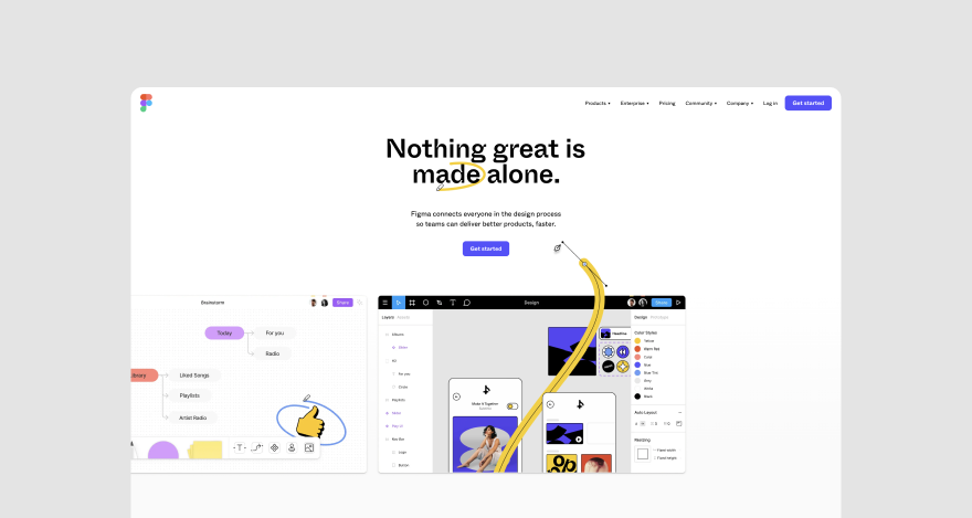
One that you’ve probably heard of is Figma – a cloud-based design tool.
Let’s cut to the chase!
Table of contents
- Step #1: Set up a Figma account
- Step #2: Create and modify new frames
- Step #3: Insert images, text, and other objects
- Step #4: Save your styles
- Step #5: Add components
- Step #6: Make auto layouts
- Step #7: Test prototypes
- Step #8: Share projects and collaborate
Step #1: Set up a Figma account
To get started on Figma, you need to have an account. So, let’s open one together.
First, go to www.figma.com and click the Get Started button at the top right corner to sign up. If you have an account with them already, click the Log in button instead.
Since this is a tutorial, we’ll go with the sign-up option. For that, Figma gives you two choices.
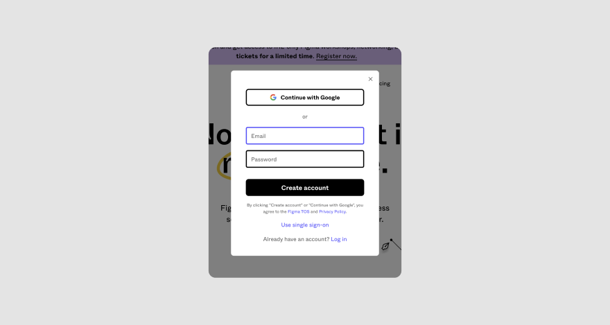
Click the Continue with Google button or enter your email and preferred password. You’ll also be asked to input your name, specify the kind of work you do, and how you intend to use Figma.
Then, click the Create account button. You’ll be sent a verification email almost immediately. Open the message and tap Verify email, and you’re all set.
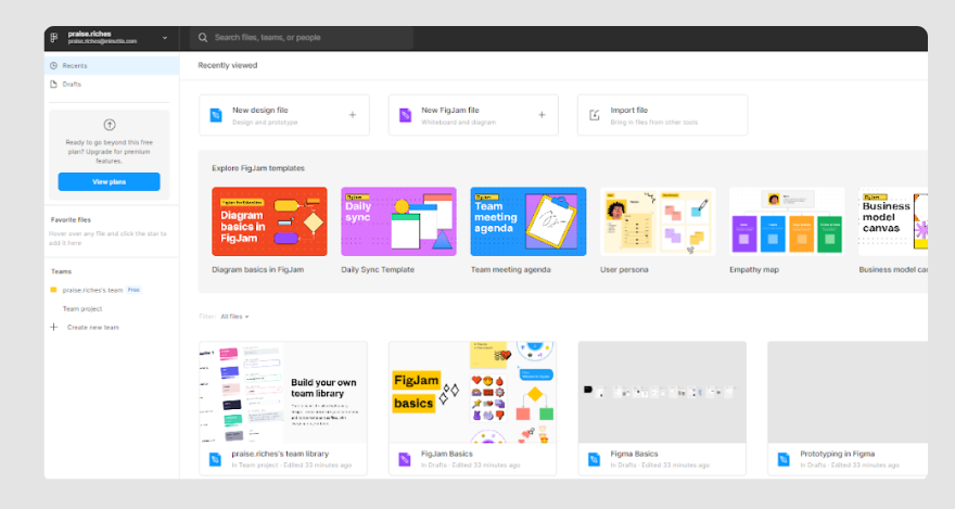
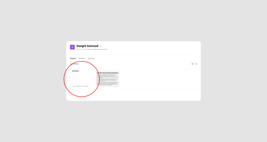
Now, you should have access to a dashboard that looks like this:
Creating new projects
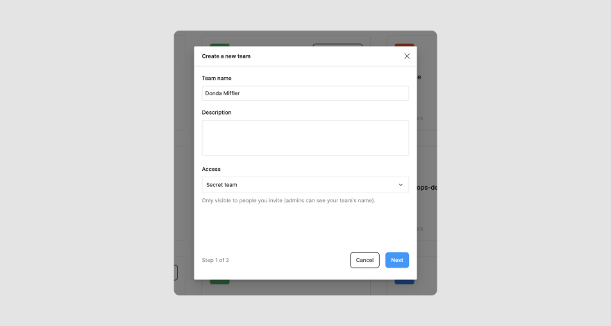
To create projects in Figma, you must be part of a team. If you already are, just join them and open their file browser. But if you don’t, click the Create new team button on the left side of the page and enter a team name. Then invite collaborators you’d like to work with you on the project.
After you’ve created a team, you’ll be taken to the team’s page. From there, you can create a new project.
So let’s do that!
Click on the New project button on the top right side of your team’s file page. Enter a name for the project if you’re on Figma’s Pro plan or select the Team project box to proceed if you’re on the free plan.
Voila! You’ve created a new project.
You can only create one project and three designs with the Free plan. But with the Pro plan, you can access unlimited projects and designs.
Adding a design file
Design files house the design you want to work on, and they can be added to the project’s environment.
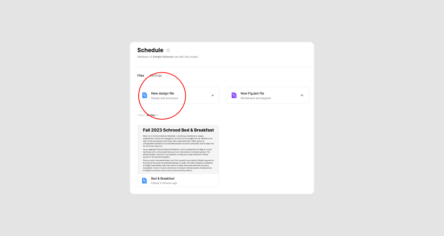
Just tap the New design file button, and you’ll be redirected to a new page that shows the Figma file like this. 👇
You can give your design file a name when you first create it. The default name is ‘Untitled,’ but you can tap on it to change it, so it’s more descriptive.
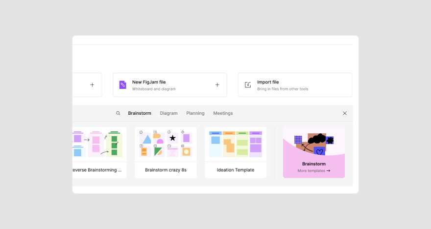
Explore Figma templates
Figma has a database of templates you can customize for your UX designs. To access them, head back to the project folder and select See all. It’s just under the New Design button you clicked on earlier.
Now that your Figma account is set up let’s start creating new frames for your design.
Step #2: Create and modify new frames
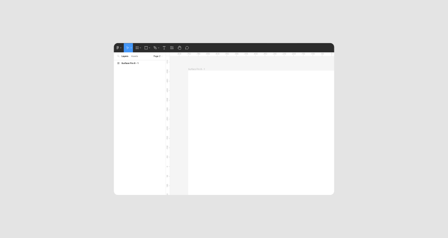
Frames are like boards on Figma. They represent the interface end users of the design will interact with. You can select different frames on Figma in which to place your design.
To create new frames, open the design file and click the Frame tool in the top left-hand corner. Having trouble finding it? Look for the button that looks like a hashtag. You can also create new frames by pressing the letter F on your keyboard.
Choosing a frame size
Once you’ve selected the frame tool, go to the left side of the page. Pick a frame from the selections available, and it’ll appear on the canvas. Available frame sizes include most iPhones and Androids.
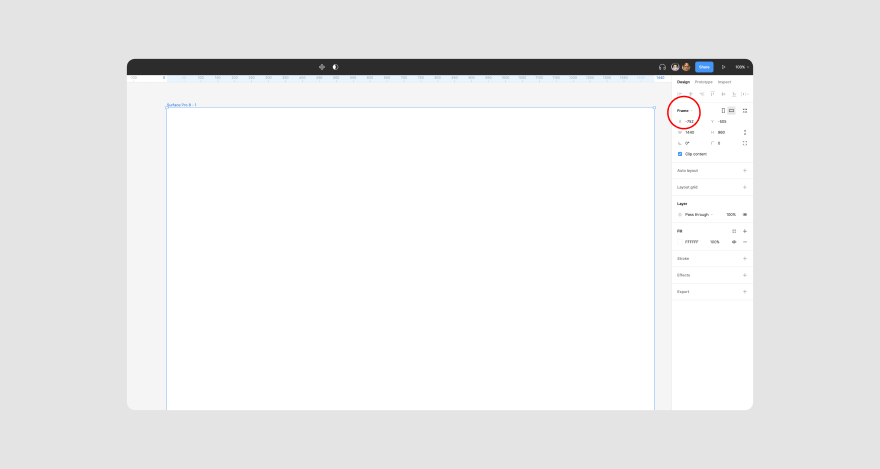
For this tutorial, let’s select the Surface Pro 8 frame:
If you need a frame different from the ones available, you can draw your own by clicking and dragging the mouse.
Editing a frame’s properties
After selecting a frame, you’ll see a panel under Design on the right side of the page. There you can assign different properties to the frame as you see fit.
For example, you can change the frame size by typing in your desired pixel size in the X, Y, W, and H columns.
Other things you can do include filling the frame with color using Fill, adding effects by clicking Effects, and more.
Using layers
On the left side of the screen is the Layers panel. Each time you add a new element or frame, a new layer is added. You can rearrange them by dragging and dropping them.
You can also group layers to have a more organized file if you want to move them across different frames. To group layers, select all the elements. Press Ctrl+G if you’re a Windows user or CMD+G on a Mac.
Vector shapes
If you want to use basic shapes (rectangle, circle, etc.), pick the square sign from the top of the page.
For more complex shapes, icons, logos, or buttons, select the pen icon from the top menu or press P on your keyboard.
With it, you can click anywhere on the frame to create the kind of shape you have in mind. Then, press Enter when you’re done.
If you want to modify the vector shape when designing, you can do so via the Properties menu on the right-hand side of the page.
What’s a design without pictures? Here’s how you add them on Figma!
Step #3: Insert images, text, and other objects
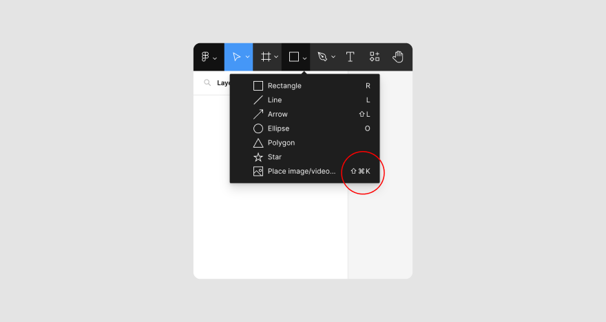
There are different ways to insert images into your frame on Figma. The most popular and simplest way is to drag and drop them into your work area.
You can also click the Shape menu at the top of the page and select Place image/video.
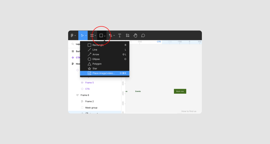
When you click Open, a dialogue box will open, where you can select the images you want to use. Then, click OK to insert the pictures.
Alternatively, press CMD+Shift+K or Ctrl+Shift+K, to open the dialogue box.
If the image you want to use is from another place on Figma, select the image and press CMD+C or Ctrl+C. Head over to the frame you want to use and press CMD+V or Ctrl+V.
But what if you want to insert the image into a different shape or frame?
To do that, click on the frame. Select Fill from the Properties menu on the right side of the work area if you want to add color.
You’ll see a drop-down menu at the top-left of the color wheel: click it and select Image or Videos.
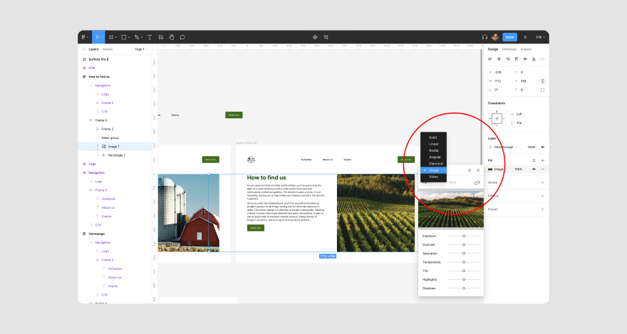
To choose an image, hover your cursor on the smaller window with black and white colors and click Choose Image.
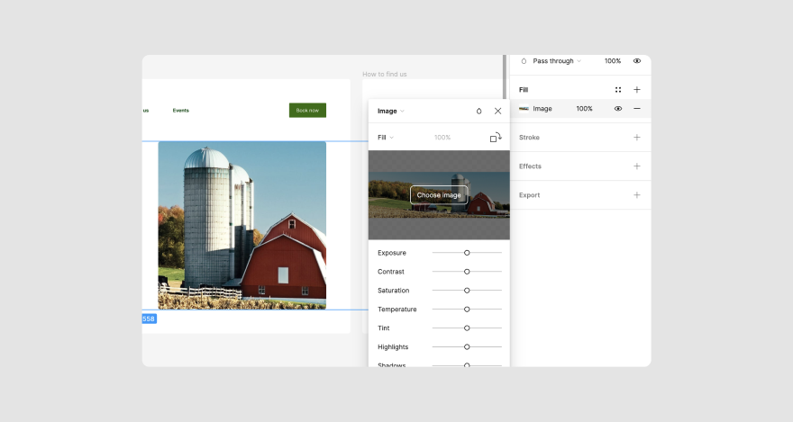
A dialogue box will pop up so you can pick the images you want. Click Open to insert them into the shape or frame.
If you want, you can edit the picture with the different parameters shown in the small window.
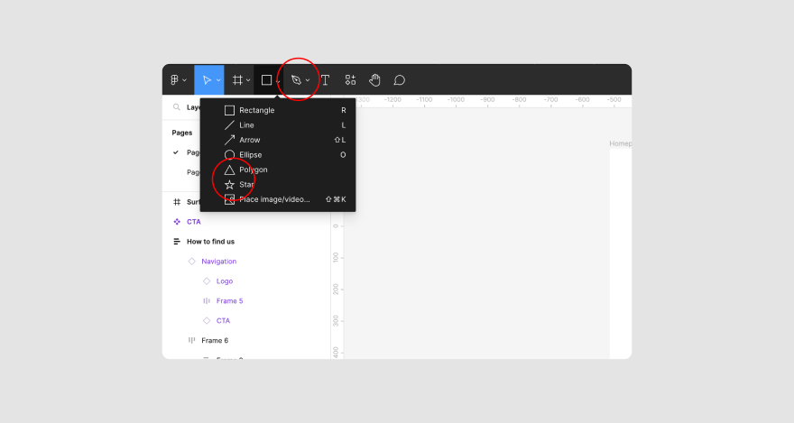
To insert objects, click the square shape icon from the top menu to draw polygons, stars, arrows, lines, rectangles, and ellipses.
Select any shape, click on the frame, and drag it to your preferred size. For a shape with equal proportions, press down the shift key while you draw.
Adding text on Figma is pretty straightforward too.
Just click the T sign and tap on where you want the text on the frame to draw a text box. Then, start typing.
To edit the text, click the text layer and double-click on the text to edit. You can also edit it from the Properties menu. There, you’ll be able to change the text’s color, font, and even edit the words in the content section.
Now, if you’re working on multiple design projects using Figma, wouldn’t it be great to have saved styles that you could simply add to each project?
To learn how to save styles, keep reading!
Step #4: Save your styles
By saving your styles, you can avoid having to redo the same design process over and over again.
For example, if you want the text headings of your design to have the same font, color, and size, you can create a style and save it as a reusable H2 style.
Then, apply that style to the corresponding headings.
Here’s how to create a text style:
- Insert text into the frame and format it to suit your desired style.
- Select the text with the style you want to save.
- Click the four dots style icon on the Properties menu.
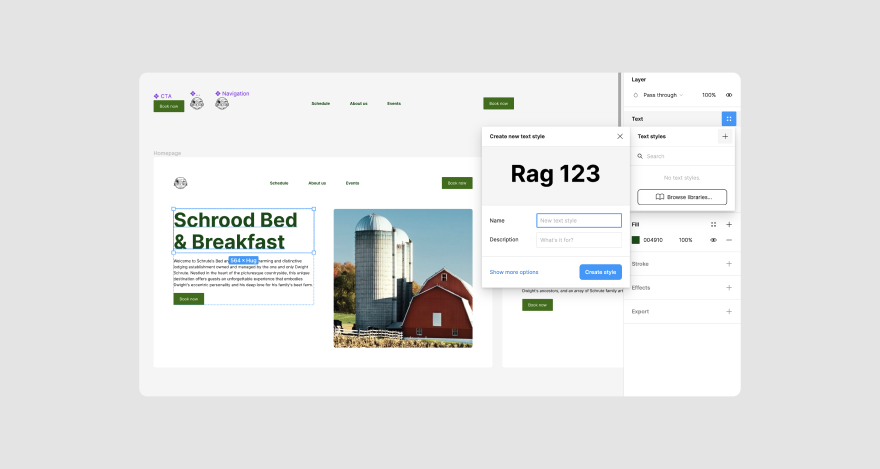
- Tap on the + sign, give the style a name, add a description, and click Create style.
To use the style, select the text you want formatted and click on the style icon to select it.
Text isn’t the only style you can save. Aside from text, you can also save colors, grids, and even effects.
As we saw earlier, saved styles can help you reuse colors or effects in future projects. To do that, you’ll need to:
- Select a shape, object, or frame with the color or effect you want to save.
- Tap the four dots at the top corner of Fill (for color) or Effects on the Properties panel.
- Click the + sign, and assign a name and description to the style.
- Click Create style.
You can follow the same steps when adding the text style to text whenever you need to reuse the saved templates.
There’s just one tiny drawback with saving a style; it’ll only be available on the file you’re working on.
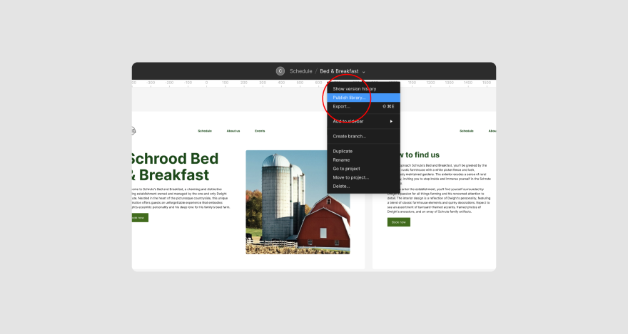
So, what if you wanna use the styles on other project files? You’ll have to publish it to your team library. Here’s how:
- Click on the canvas (the one housing the frame)
- Select the down arrow beside the file’s name at the top of the page
- Select Publish library and follow the on-screen instructions
That’s about it for saving styles. This should help you save time when brainstorming, wireframing, or designing.
To further simplify this process, you might want to consider adding reusable components to your design workflow.
Don’t worry, we’ll unpack what it means and how to add them in the next section.
Step #5: Add components
Components are collections of UI elements, objects, or layers that you can repeatedly use across your design. They make it easy to maintain a consistent design to update or scale your work without stress.
Let’s assume you’re working on web design and want the logo and name of the brand to appear across the site.
Those are different elements that you can reuse. You could add both to a component and title it ‘brand logo.’ Then, add it to other frames.
Follow these steps when adding components:
- Go to the left side of the workspace and select the layers you want to add to the component while pressing down the shift key.
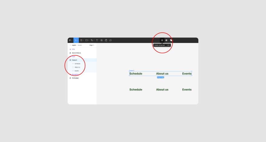
- Then, click the component icon, which combines small diamonds at the top of the page, to group the layers together.
You’ll notice that both layers will be fused into a single layer with the new name: ‘Component 1.’ You can rename it by double-clicking on the name.
- Next, create component icons or instances of a component.
This refers to the use of iterations of the components in your design that are not in the initial component.
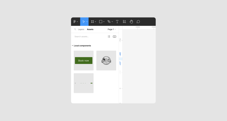
To create a component icon, click on the Assets panel, the tab next to the Layers menu on the left side of the page.
Select and drag the component’s name to the canvas, creating an instance. You can edit the component icon, which won’t reflect on the original.
Like styles, you can save components for other files or projects.
Click anywhere on the canvas and select the down arrow beside the file’s name at the top of the page.
From the drop-down menu, click Publish library and follow the on-screen instructions to publish the component to the team library.
This feature, however, is only available to Pro or Enterprise users.
Still, in simplifying your processes, there’s another thing you can do…
Step #6: Make auto layouts
Auto layout is a function that lets you create a dynamic frame that expands or contracts when you change the content inside it.
This will help you avoid having to adjust the frame repeatedly. It also lets you see whether your design works in real life with a single click.
To begin, change layers to auto layouts:
- Write your text the way we showed you in Step 3 above
- Press shift+A to create an auto layout frame around the text. You should see a Frame 1 box appear around it.
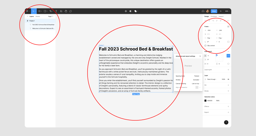
As you change the content, the box automatically resizes.
Nested auto layouts
Figma also lets you nest auto layouts, meaning you can have a frame within a frame for a more attractive user interface or UI design.
To nest auto layouts, you should have multiple elements or objects you want to merge.
Select them, press shift+A, and you’ll have a nested auto layout.
It should include a parent frame and a child frame.
And that’s about it for auto layouts!
You know how you can take a car you plan on buying for a test drive?
Well, you can do the same for your interface design. But on Figma, it’s referred to as testing prototypes, which we unpack next.
Step #7: Test prototypes
Whether you’re designing a mobile app, landing page, or website, you can test the user experience of either project on Figma’s space in real-time. Testing will help you know what needs to be improved.
To start testing, head over to the Properties menu on the right side of the page. Click the Prototype tab at the top of the panel.
The first thing you’ll likely see is the option to select the device type you want to preview the design on.
If you already selected the device you were designing for when you created the frame, you won’t see that option.
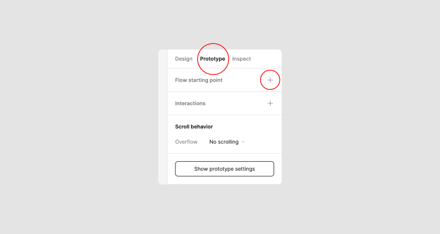
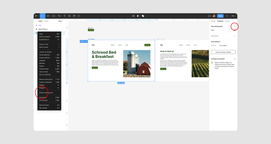
To proceed, click the + sign beside Flow starting point.
It will place a Flow 1 text at the top left corner of the first frame to indicate that as the starting point of the design flow. If you don’t want the selected frame as the first point, right-click the frame’s name and pick Delete starting point.
After selecting the starting point, you must select a hotspot from the starting frame. A hotspot is an area or element users must click to be directed to the next page.
To pick a hotspot, hover over the desired element and see a blue circle by the edge.
When your mouse is directly on the circle, a plus sign will appear. Click and drag the hotspot (+) to connect it to the next screen. It should look like this:
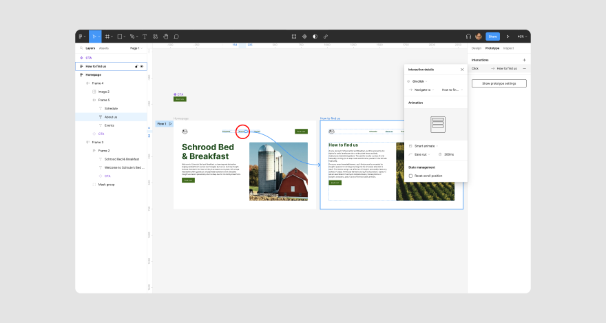
After making the connection, you should see an Interaction details panel.
There you can choose an interaction type for the hotspot. For instance, select On tap if you want the user to tap the hotspot to go to the next page. You can also choose an animation from the menu to show the transition between both screens.
Now, you can make more connections by selecting a hotspot on the second screen that, when users tap it, will link back to the first screen.
When you’re done, you can preview the web or app design by clicking the Play button at the top right corner of the screen.
If you’re comfortable with the final designs, there’s only one step left: invite team members or other stakeholders to collaborate.
Step #8: Share projects and collaborate
Sharing a project with your team, aka developer handoff, is easy on Figma. Just click the Share button at the top right corner of the page.
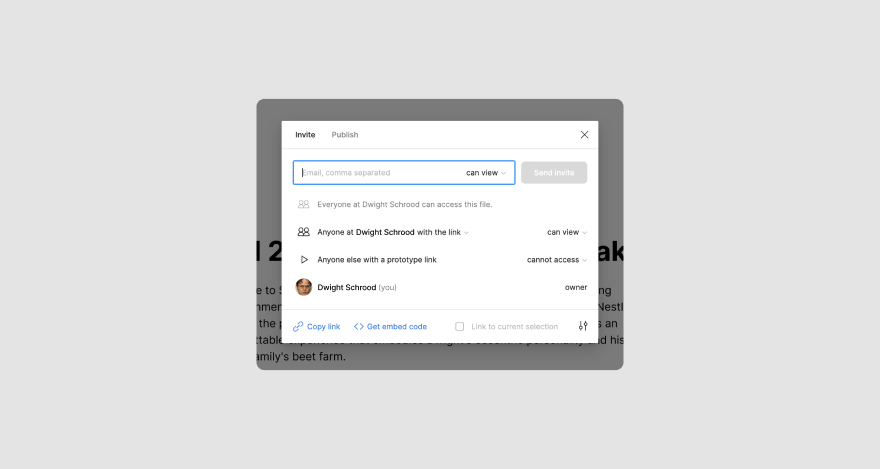
Then, enter the email of other users or collaborators you want to share it with.
A shortcut is just to copy the link and share it with stakeholders. If you go with this option, update the security setting to Anyone with the link.
***
And with that, we’ve come to the end of this tutorial.
Whew, that was a lot! But we’re confident that you’ve gained a lot from this guide.
Just one more thing, and we can call it a day.
Wrapping it up
So far, you’ve learned how to use Figma for designs, mockups, and as a prototyping tool.
What you need, in addition to that, is a more streamlined design process that can help you get clear contextual feedback on your visuals.
While Figma allows you to add comments, you can do much more with MarkUp.io.
More specifically, you can optimize reviews, implement feedback, and keep track of the comments as you resolve them.
There’ll also be less confusion for clients who probably won’t get the hang of the design tool you’re using. Feel free to claim a free 30-day trial with MarkUp.io to see for yourself.