
If a user has to click 10 buttons to subscribe to your newsletter, they’ll probably abandon the process halfway through.
Luckily, you caught that potential disaster before the layout of the website was even created. By reviewing the user flow created by your designer ahead of time, that 10-button process was a mistake that didn’t cost you a penny to fix.
Now, you’ve decided to make user flows an integral part of your workflow. We’re so happy you made that choice!
To support your quest to streamline your design workflow, we’ve put together a user flow guide with examples and tips that will make user flow creation a breeze.
Before we dive in, let’s make sure we’re talking about the same thing first.
Table of contents
- What is a user flow?
- 7 examples of user flows
- 3 common types of UX flows (with visuals)
- What are the benefits of creating user flows?
- How to create user flows in 5 easy steps
What is a user flow?
User flows (also referred to as flowcharts or user experience [UX] flows) are diagrams that map the path a buyer persona or target audience has to follow to complete a task when using an app or a website.
Simply put, user flows show you the steps users take to complete an action (e.g., subscribing to a newsletter, purchasing a product, etc.). They’re a great help in UX design!
The user flow offers designers and stakeholders a visual overview of how easy it is to use a platform. With these diagrams handy, you can visualize how easy or difficult it is for visitors to get what they came looking for on your website or app.
And that’s not even the best part of creating user flows!
User paths are created before designers work on the actual website. And when that piece is in place ahead of time, user flows help designers minimize feedback loops while ensuring revision requests don’t take ages to implement.
We’ll get more in-depth on the benefits of user flows in a second.
First, let’s see what a typical UX flow looks like.
7 examples of user flows
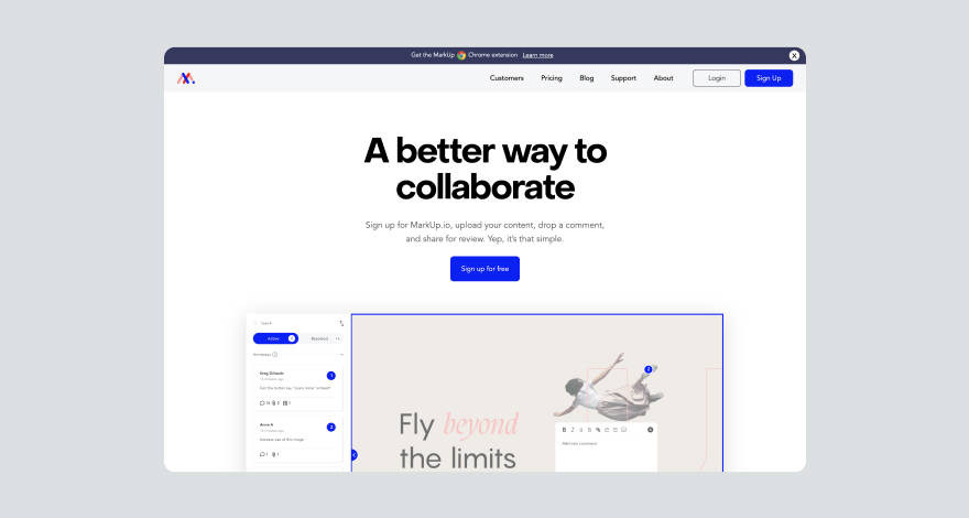
Have you ever abandoned an online platform because the registration process was too long and complicated? When designing this user flow for MarkUp.io, we knew that we needed to make the sign-up process as frictionless as possible for this exact reason.
Here are the steps new MarkUp.io users take to register:
First, go to MarkUp.io and click on the “Sign Up” button at the top right of the page.
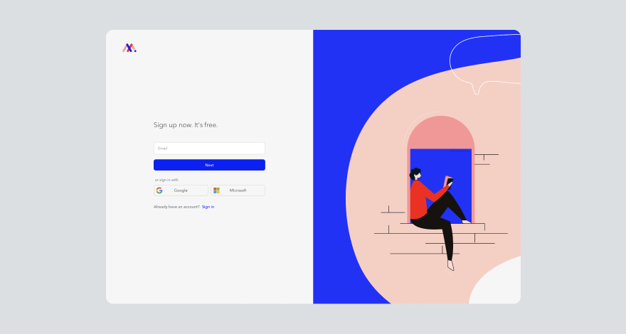
Next, enter your email address, type in your name, and set up a password.
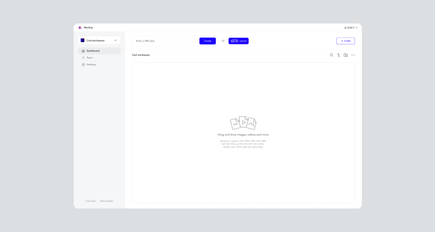
Finally — and this is the most important step of all — enjoy your new MarkUp.io account. 😉
These are the steps that typically happen during a sign-up user flow.
Other common user flow examples include:
- Zoom’s flow for setting up a video meeting
- Loom’s flow for screen recording
- Shopify’s flow for adding a new product to your e-commerce shop
- YouTube’s flow for searching and playing a video
- Chrome’s flow for bookmarking a blog post you love
- Spotify’s flow for adding a song to your playlist
Basically, any action you take on a website was probably carefully mapped into a user flow before the site was even designed.
Designers create user flows for email subscriptions, landing pages, signing up for online events, canceling a subscription, and anything in between.
All these UX flow examples can be represented in three different ways.
3 common types of UX flows (with visuals)
UX flows come in different shapes and sizes. We’ll discuss three that are most relevant for any team of designers.
Let’s start with the star of the show—the user flow.
Type #1: User flow
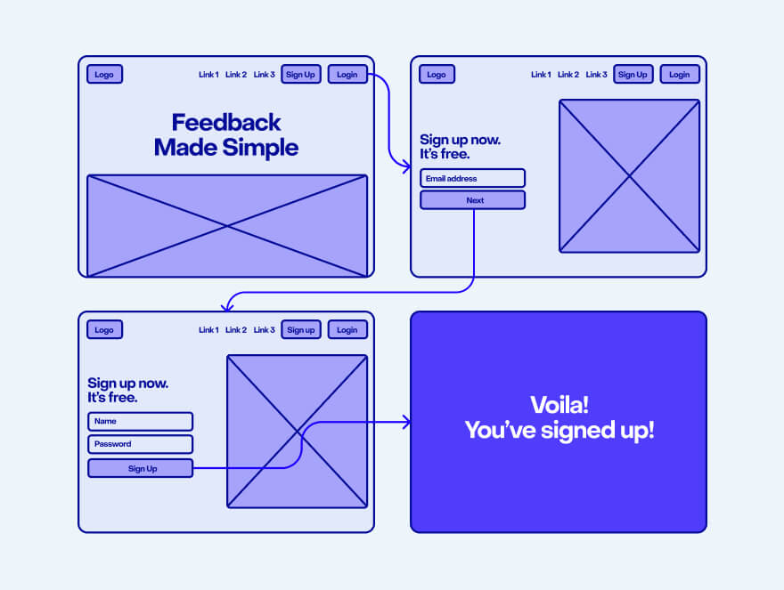
As you already know, user flows are visual representations of a user’s interactions and decisions on their journey to perform a task.
A user flow consists of:
- Specific entry and exit points (e.g., start=homepage; end=“Thank you for subscribing!” page)
- Different scenarios based on a user’s decisions (e.g., two different paths: one for a user choosing to create an account on a platform, the other for a user who chooses to continue using the platform without an account)
- The name of the website pages or app screens the user navigates to
- The user’s interactions with the platform, website, or app
For example, here’s a user flow for a potential MarkUp.io registered user:
Type #2: Task flow
A task flow is very similar to a user flow. What differentiates the two is that a task flow is focused on specific tasks rather than the decisions a typical user could make when executing a task.
Usually, task flows are user flow components with single and simpler pathways.
Task flows don’t simulate a user’s decisions and steps when performing an action. Instead, they document the thought process behind the flowchart’s design.
Plus, task flows don’t include entry points and exit points.
The task flow in the example below only showcases the specific action of leaving a comment on a MarkUp after navigating to it from the user’s Workspace. It doesn’t cover the other options the user has to access the MarkUp (e.g. clicking the Share link the user received).
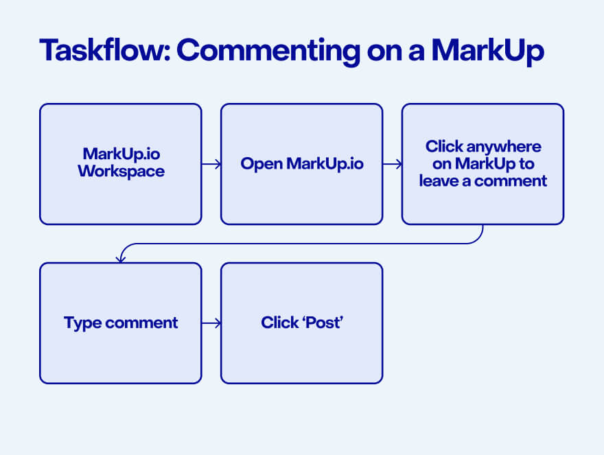
MarkUp.io Workspace → Open MarkUp → Click anywhere on MarkUp to leave a comment → Type comment → Click ‘Post’
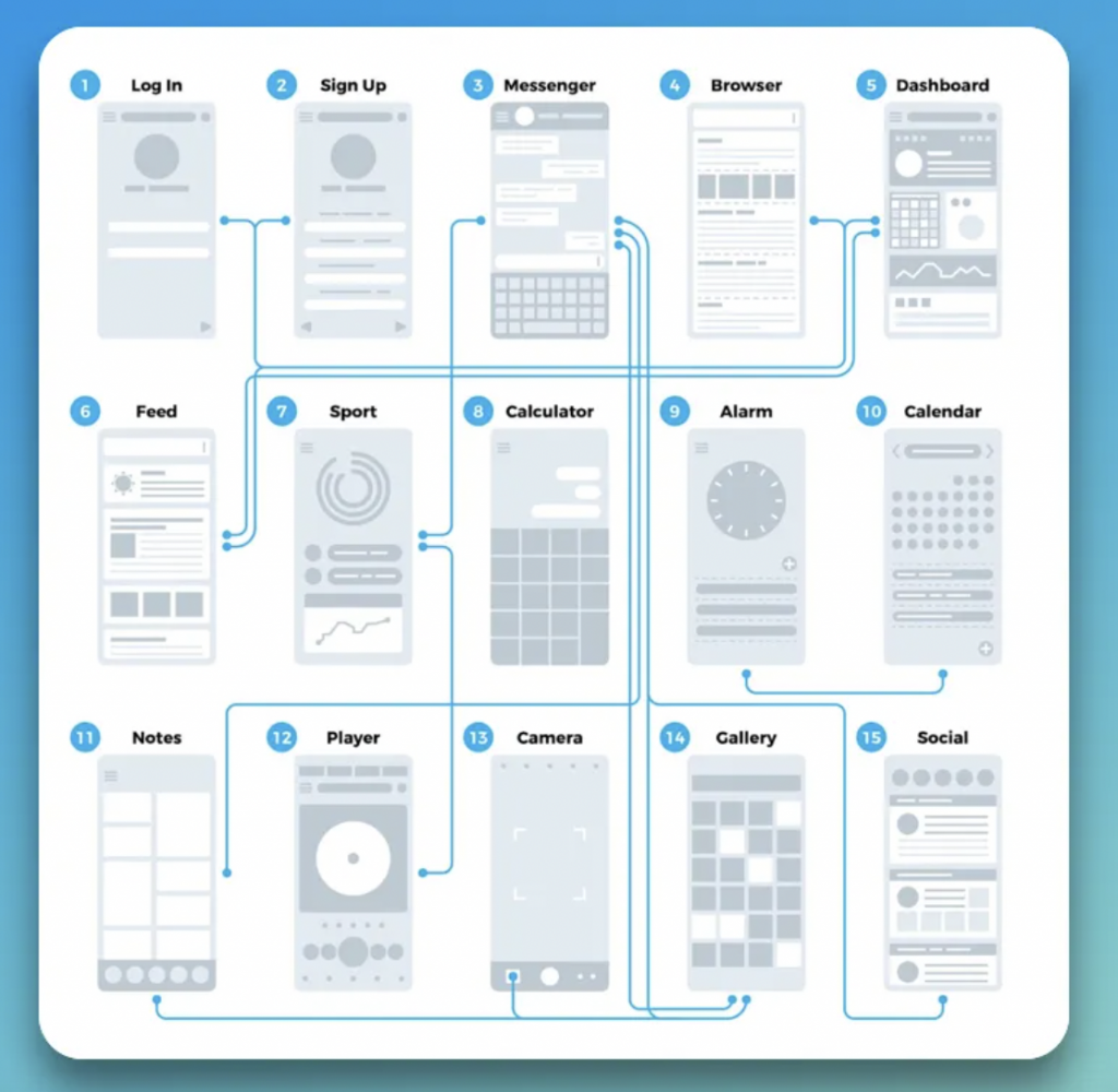
Type #3: Wire flow
Wire flows combine the illustrative style of a wireframe with the logical sequencing of actions specific to user flow diagrams.
In addition to the user path, wire flows also document the actual page design and user interface (UI) design layouts.
Below, you will find a wire flow diagram used in app design. It contains different screens of the apps and their dependencies. It’s basically like an app map with design mockups.
If we were to place these UX flows on a web design timeline, user flows and task flows come before wireframing whereas wire flows come later in the process after the design mockups and wireframes are created.
So much technical stuff, and yet…what’s the point?
Glad you asked…
What are the benefits of creating user flows?
Let’s circle back to the story where a user would leave your website if it takes them 10 clicks to get where they want to go.
Even though the three-click rule has been disproven, user flows are still vital to designing a smooth user journey.
Why? Well, the main reasons user flows are important include:
1. Understanding the customer journey
User flows explore all the decisions and paths a user can take when interacting with a digital product, making it easy for designers to identify potential bottlenecks and pain points in the navigation process.
When designers can easily visualize the UX design from a user’s perspective, they have a better understanding of all the key touch points within the customer journey.
Inevitably, designers who integrate conceptualizing user flows into their standard workflow pay more attention to the five main customer journey phases:
- Awareness: What’s the first interaction a user has with the brand? (e.g., clicking on a paid ad and reaching a landing page with a clear call to action [CTA])
- Consideration: Why should the user buy the product or service? (e.g., they will read about the benefits and advantages strategically placed right above the CTA button)
- Purchase: How easy is it for customers to add products to their cart and complete the checkout? Is the whole experience smooth and logically structured?
- Retention: Are users aware of their rewards? Is the discount offer on their second purchase visible? Maybe a pop-up screen added to the retention flow will draw users’ attention more than a static text box on the “Thank you for your purchase” page.
- Advocacy: How can users spread the word about the brand/product/service? (e.g., sharing one of your website’s blog posts by using social sharing buttons that are easy to view at the bottom of the page).
Answering these questions and adapting the UI to accommodate specific user needs helps designers understand and anticipate user actions, which ultimately leads to a better understanding of the customer journey.
2. Increasing conversion rates
An improved customer journey leads to more conversions. It’s the only logical result of having a detailed map of your users’ trails when they interact with your website.
This overview of key touchpoints helps teams optimize their conversion strategy.
Think about it: a user flow offers you the information you need to place targeted copy and strategic design in key points along a customer’s journey.
What else could result from this other than more purchases, subscriptions, CTA clicks, and other final actions leading users right to the bottom of your sales funnel?
3. Saving time and money
User flows also help you make the whole design process more efficient—specifically in the review phase.
It’s easier and way cheaper to make edits to prototypes than actual websites, don’t you agree?
Imagine how easy it is to drag and drop a couple of placeholders into different positions instead of editing code.
Even if you use a no-code content management system like Webflow, it’s still faster to make some changes to a user flow in Figma than to edit your completed web design project.
4. Brings user experience into the spotlight
It’s easy to lose yourself in the enthusiasm that comes with a new project. For creatives, a new website is like a white canvas waiting to be elevated with color and aesthetically pleasing designs.
In UX design, although things still need to be pretty, user experience comes first.
User flows guide designers into creating a customer journey map before unleashing their creativity. This way, they eliminate guesswork and stay on track with usability and functionality along the way.
Plus, these diagrams provide design teams with a clear structure to follow to ensure that they create a website that offers a great user experience as well as a cool design.
Ok, user flows have a lot of benefits, we get it. We’re in.
Now, can we skip to the how-to part?
We thought you’d never ask!
How to create user flows in 5 easy steps
If you’re sold on the advantages of using user flows but not too stoked about adding an extra task to your workflow, it helps to think about it as a part of the design process.
The user flow chart you’re creating before working on the actual website is just a deliverable that will guarantee you a smooth UX design process.
Trust us, it will make your life easier when you get to the review and approval stage.
Creating a user flow is a straightforward process. We’ll walk you through the five steps that will save you from frustrating feedback.
Step #1: Establish your starting point
First things first: how are visitors getting to your website?
Is the client running a paid advertising campaign that leads to the landing page you’re creating? If that’s the case, your starting point is the social media platform the ad is running on.
If you’re working on a regular blog, the starting point is organic search.
Figure out where the visitors are coming from and add your starting point to the flow chart.
We told you it was easy!
Step #2: Identify user needs
Users visit a website with certain expectations.
For instance, if a visitor lands on a website as a result of a search query for “accounting software” they’re most likely interested in purchasing a tool that streamlines their financial operations.
What would visitors expect to get from accessing your accounting software website?
Well, they will need details like:
- Features supported by the accounting tool
- Benefits and competitive advantages of using your software
- Pricing plans
- How easy the software is to use, i.e. the learning curve, onboarding, etc.
- Industries the software is for
- Social proof in the form of case studies or customer testimonials
To determine the user needs, do some UX research by visiting competitors’ websites and try to identify missing elements that a visitor would want to find on such a website.
Or, even better: search for a product similar to your client’s with the aim of purchasing it for your company.
When you become the customer (even if it’s just a simulation), it becomes easier to anticipate visitors’ expectations. It’s like you’re impersonating the user persona.
Step #3: Determine your objective
Next, think about what action you expect users to take before leaving your website.
For example, decide if visitors are expected to:
- Subscribe to your newsletter
- Sign up for a free demo
- Create an account
- Book a sales call
- Read a specific blog post
- Share your website with a friend
The final action the user makes will be your user flow’s endpoint.
Step #4: Document all the possible user paths
All that’s left to do is to map the steps a user can take between the starting point and end point while keeping the user’s needs in mind.
Document each function, menu, button, and command the users will interact with on their path. Also, make sure to account for scenarios influenced by users’ decisions (e.g., browsing to find a blog post instead of using the search bar).
When doing so, you can use different colors and geometric shapes to mark specific pages, elements, and key moments along the user flow. For example, you can use:
- Circles for your starting and ending points
- Rectangles and squares to signal users’ actions
- Diamonds to mark decision points
- Arrows to display dependencies and connections between elements
Step #5: Share user flow with stakeholders and gather feedback
After all the data and paths are brought together, share your user flow with team members, clients, and other relevant stakeholders to ensure everyone’s onboard with your design.
To simplify the file sharing and review process, you can use visual feedback tools instead of sending your deliverables by email.
Let’s take MarkUp.io for example. The platform enables you to create a virtual copy (called MarkUp) out of design files, images, text documents, and even live websites.
Once created, you can share the MarkUp with your peers via a link or email invitation. The reviewers can click and comment on any element that they’d like changed.
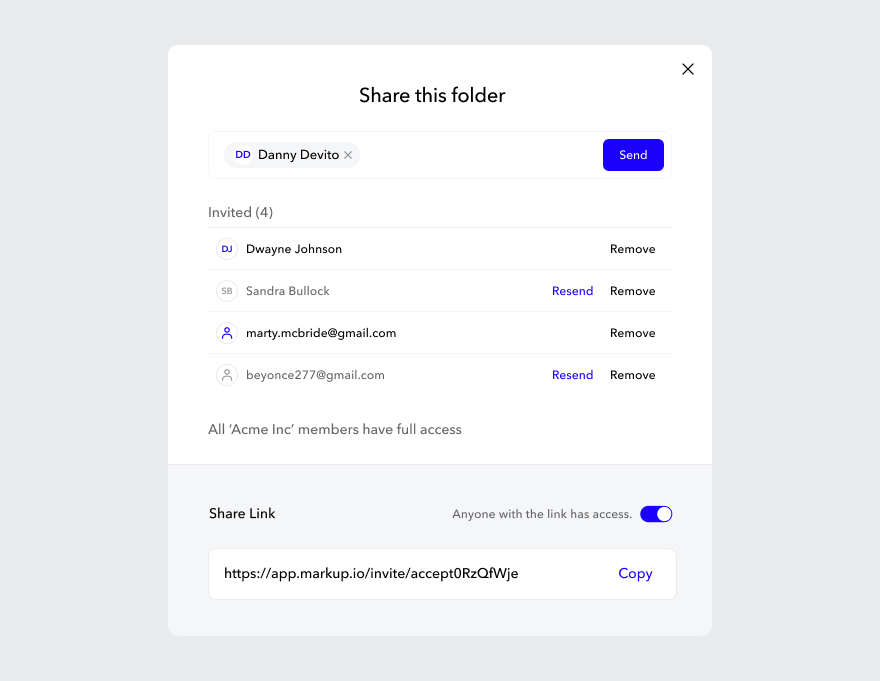
The point-and-click commenting feature makes feedback contextual and easier to understand and implement, streamlining the whole approval process.
As soon as everyone involved has submitted their input and added their comments, you can implement everything and start working on the website or app interface.
Now that you saw how easy it is to make these things, we know you’re pumped to start working on one.
But before you go…
Now over to you
Are you excited about making your workflow more efficient?
We know you said “yes”!
If we were right, make sure to check out MarkUp.io. Our platform helps you collect feedback that’s easy to understand and implement.To share your user flows and other design deliverables with stakeholders the easy way, sign up for your 14-day free trial with MarkUp.io!